This Week's Sponsor:

Kolide

Ensure that if a device isn’t secure it can’t access your apps.  It’s Device Trust for Okta.


Search results for "number of instagram users"

Instagram 2.0 Now Available: Live Filters, New Camera UI, Faster Engine

Instagram, the iPhone-only social network for sharing photos with your friends, has released a major new version of their app today, which reaches version 2.0 and adds a number of new features, updated interface design, and a new icon.

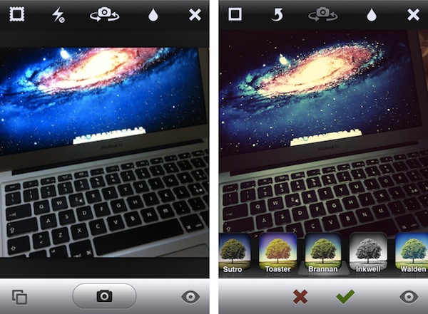
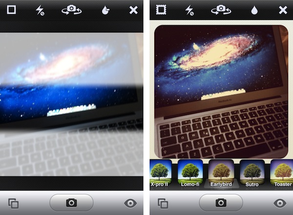
The most notable change in Instagram 2.0 is the implementation of live filters. In previous versions of Instagram, every time you took a new photo with the app’s dedicated camera UI you had to apply a filter after the photo was taken, and if the filter was not okay for the photo, you were obviously forced to go back to main screen and re-shoot. Having to retake a photo to make it play nice with a selected filter could lead to several problems – your favorite “moment” may be gone forever, and you’d end up with multiple shots to choose from. In Instagram 2.0, the camera screen has been completely re-imagined to accomodate live filters and tilt shift – meaning, you can see how a filtered photo will look like before you take it.

Thanks to iOS’ powerful live image editing and photo-taking functionalities, the developers have been able to develop a solution that lets you instantly see how filters will apply to your photos – no need to shoot and apply separately.

From this new camera view, you can scroll filters at the bottom, or play with a series of buttons along the top. These buttons let you snap a photo without borders, activate/disable flash, swap cameras, or tweak live tilt-shift. The latter option is particularly amazing when seen in action, as it updates the camera view in real-time with different types of tilt-shift as you tap on the screen.

Alongside being able to see how filters will look like before taking a photo, Instagram version 2.0 comes with four new effects (Amaro, Rise, Hudson, and Valencia). Users can still decide to take a photo without effects and apply them later (simply don’t tap on the filters icon in the toolbar), but from what I’ve seen so far, performances of this update on the latest iPhone hardware really make for a fast and smooth experience when playing with live filters. We tested the feature on an old iPhone 3GS and the transition between effects was very smooth on that device, too. The Instagram developers say the new filter engine is up to 200 time faster than before.

Since the day we launched, one core part of the app has remain largely unchanged: the camera. In the past, we’ve added filters & tilt-shift, but the base technology has never evolved. Today that all changes as we introduce a complete upgrade to Instagram’s camera with a brand new technology layer.

See the world through Instagram’s stunning effects before you even snap a photo. Simply select a filter, hold the camera up to the scene and see the world through Instagram’s visual effects. We’ve re-written your favorite Instagram filters to be over 200x faster so even after having taken a photo, switching between them takes no time at all.

The new Instagram is also geared towards giving users more control over how their photos are snapped, and shared with the world. Besides being able to remove borders and rotate a photo after it’s taken, photos are now saved at much higher resolution in a device’s library – photo size has been increased from 612x612 to 1936x1936 on the iPhone 4 (1536x1536 on the iPhone 3GS). This was one of the biggest complaints with the original Instagram, and the developers are surely on the right path to deliver an app that’s equally fast at sharing photos, and saving them at high quality.

As the service is now nearing 10 million users, it’s interesting to look back at my initial review of Instagram last year and see how much has changed. In spite of the new features introduced today – a refreshed interface, live filters, higher photo sizes – Instagram is still the same app that allows users to share photos with a new “social paradigm”. Instagram has reinvented the way photos can be “beautified” and shared on mobile devices to multiple social networks, ultimately building a social network on its own that’s now attracting millions of users and popular brands.

You can find Instagram 2.0 on the App Store.


Carousel Instagram Client Gets Gestures, Search, Refined UI

Back in May I reviewed the first version of Carousel, a beautiful Instagram client for Mac that, thanks to the Chameleon framework built by The Iconfactory, brought Instagram’s photo streams and profiles to the desktop with a gorgeous iOS-like user interface. Whilst in the past month, with Lion nearing its final release and the WWDC, we’ve seen several examples of iOS apps making the big leap to the Mac, Carousel was one of the first apps to try the iPhone-inspired approach with a vertical layout, tabs, and popover menus. Together with Twitterrific, Carousel is a fine example of iOS interface schemes coexisting with more standard Mac applications.

Carousel 1.1, released today, adds a number of new features and refinements to make the Instagram experience on OS X even more beautiful and easy to use. First off, search: you can now search for specific @users or #keywords on Instagram, pin your searches as you would in Twitter for Mac, or click on tags and usernames in photo comments, which now are better styled to indicate the original author’s caption. Saved searches sit below the search bar, but to perform a search you’ll have to choose an element from a popover menu. The app has gained a new “likes” tab to see all the photos you’ve liked and a fetch separator to start where you left off in the stream, but more importantly gestures are now supported to easily open a photo in Quick Look (pinch and zoom) or check out a profile (swipe on the photo). It feels very natural and smooth using a Magic Trackpad.

Among the little fixes and refinements, the developers have updated the iOS-like toolbar to make sure the selector is draggable (try it, neat animation in there) and the comment form remains visible even if you click outside of Carousel’s main window.

Carousel 1.1 is a solid update for the most beautiful and intuitive Instagram client currently available on the Mac. You can buy Carousel at $4.99 on the Mac App Store.


A Survey of Popular Apps Currently Compatible With Apple Vision Pro

Source: Apple.

Source: Apple.

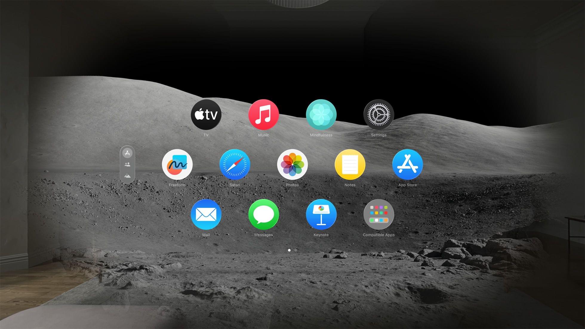
We’re excited about the Apple Vision Pro. In planning our coverage at MacStories, we’ve already collected a list of over 50 apps from some of our favorite developers who have been hard at work on visionOS versions of their apps. Soon after the Vision Pro ships, you’ll start seeing reviews of the best of those apps on MacStories.

However, as we surveyed the App Store, looking for the best examples of upcoming Vision Pro apps and heard the news that Netflix won’t be building a visionOS app or making its iPad app available on the new device, it got us thinking. What other popular apps aren’t coming to visionOS yet, and of those that are, which have gone to the trouble of creating native experiences?

Read more


Tom Coates on Integrating Threads with the Fediverse

Just before the holidays, Meta held a meeting at its San Francisco offices with members from the fediverse community about its plans to use ActivityPub to integrate Threads with Mastodon. Last week, Tom Coates wrote a detailed post about everything covered during the meeting from Meta’s roadmap for Threads to Meta’s motivations, content moderation, and Threads’ algorithm, which is lengthy but well worth reading in its entirety.

Coates described Threads’ roadmap as follows:

  • December 2023 – A user will be able to opt in via the Threads app to have their posts visible to Mastodon clients. People would be able to reply and like those posts using their Mastodon clients, but those replies and likes would not be visible within the Threads application. Threads users would not be able to follow or see posts published across Mastodon servers, or reply to them or like then.
  • Early 2024 (Part One) – the Like counts on the Threads app would combine likes from Mastodon and Threads users

  • Early 2024 (Part Two) – replies posted on Mastodon servers would be visible in the Threads application

  • Late 2024 – A “mixed” Fediverse and Threads experience where you will be able to follow Mastodon users within Threads, and reply to them and like them

  • TBD – Full blended interoperability between Threads and Mastodon

The schedule struck Coates as both optimistic given the complexities involved and likely to be controversial because the early stages are lopsided in favor of integrating Threads into Mastodon and not the other way around. As Coates explains, there are technical, legal, and regulatory reasons for that, but that won’t make it any less contentious.

Scale is quite literally another huge problem for Meta that could easily lead to unintended consequences that cause problems for Mastodon users no matter what Meta’s intentions are. As Coates explains:

The community that Threads is planning to participate in is that of Mastodon servers federating with one another via Activity Pub. The estimates of this community are that there are about 9,500 separate mastodon instances participating in this ecology, with roughly 1.5 million Monthly Active Users (MAUs). This is a fairly substantial number but of course it pales in comparison to Meta more generally, which has closer to three billion active users. Or to put it another way, Mastodon users represent about 1/2000th of the number of people using Facebook/Instagram/Threads/WhatsApp etc. worldwide.

Threads itself has only been around for a few months now and it still towers over the rest of the Mastodon community in terms of users. It’s based on the Instagram user base, and Instagram users can opt in to use Threads with a single tap. Because of that—as of a recent earnings report—Meta can currently claim around 160 million total users and about 100 million MAUs for Threads alone. So, again, maybe we shouldn’t be thinking about Threads ‘integrating’ with the fediverse and instead think about Threads attempting to engage with the Fediverse without entirely crushing it in the process.

The entire post is worth reading because it explores interesting ways to deal with distributed content moderation, identity, public education about federation, and all the other large-scale problems that Threads will bring with it into the fediverse by virtue of its size and commercial goals as an ad-funded company. None of these issues will be easy to solve, and the meeting happened before an upturn in objectionable content served by the Threads algorithm to many users. However, I’m still encouraged by Coates’ overall reaction to the meeting and the teams at Meta who are working on integrating Threads with the Fediverse:

But I can report that in my opinion the teams building it and the integration seem to be decent people, trying to build something they’re excited by, wanting to be part of something new and truly federated, and wanting to be respectful and careful about how they do it. And whether or not you think their arrival in the space is a good thing, that apparent good faith and care has mitigated at least some of my concerns.

Permalink

macOS Sonoma: The MacStories Review

In one sense, the story of this year’s macOS update is that there is no story, but that’s not exactly right. Instead, it’s a bunch of stories. It’s the tail end of the realignment of macOS with Apple’s other OSes that began with macOS Catalina in 2019. However, Sonoma is also part of a work-at-home story accelerated by COVID-19. The OS is also linked to the story of visionOS, only part of which has been revealed. Sonoma is a bundle of narrative threads built on the foundation of past releases, adding up to a collection of updates that will be less disruptive for most Mac users than recent macOS updates. Instead, Sonoma is packed with a variety of useful new features that help draw it closer to iPadOS and iOS than ever before, design enhancements, and a few disappointing omissions.

The timing for a more modest macOS update is right. In recent years, Mac users have had to adjust to substantial redesigns of everything from their favorite system apps to the Finder’s windows and toolbars. The changes were inescapable and necessary to harmonize the Mac with Apple’s other products, but also disruptive for some long-time users.

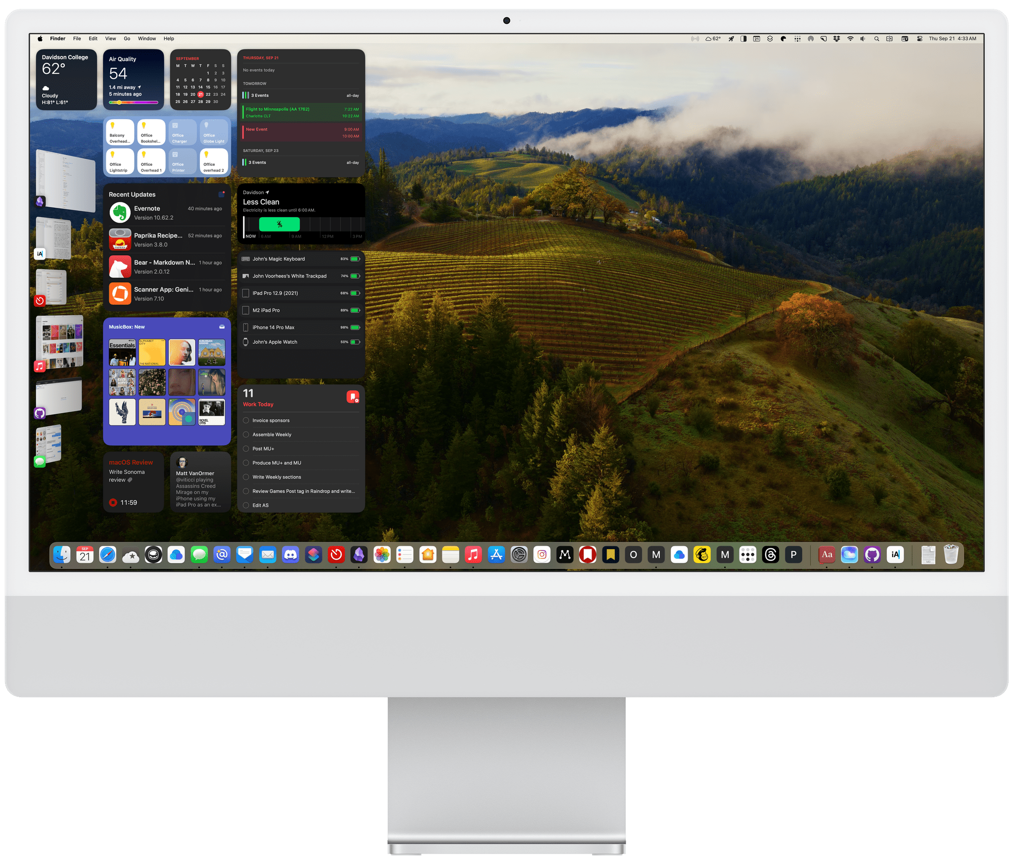
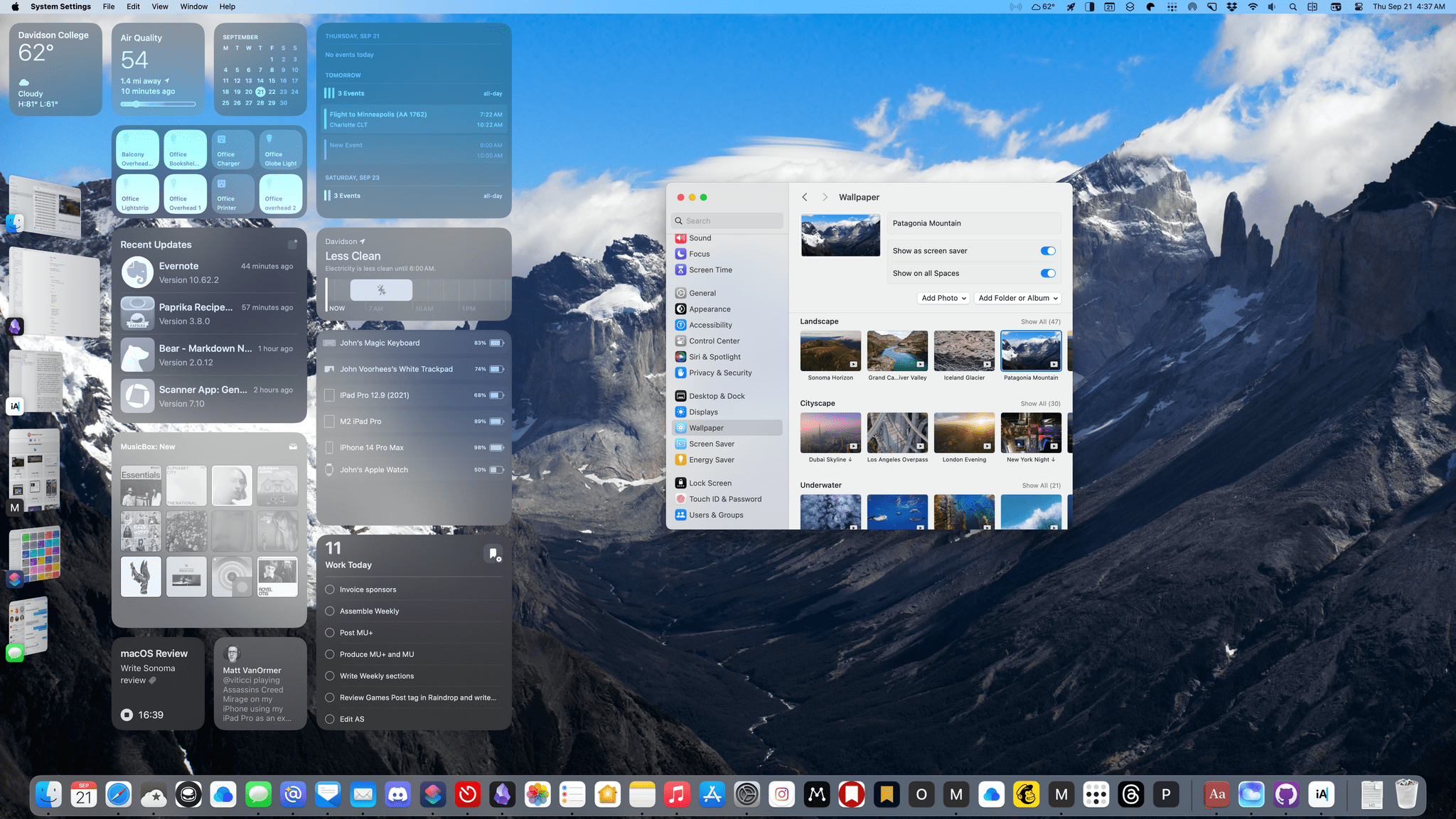
Sonoma adds a vast collection of new wallpaper and screensaver options.

Sonoma adds a vast collection of new wallpaper and screensaver options.

With macOS Sonoma, the biggest design shifts seem to be behind us – at least for the time being. Interactive widgets on the desktop are a big change this year, but it’s not like macOS dumps a bunch of them on your desktop by default. If you never want to see a widget anywhere near your desktop, you don’t have to. Other than the subtle way the login screen has changed and the new screensavers and wallpapers that are available, the core macOS experience has barely changed.

Instead, this year’s update is primarily about refining and building upon the foundation of the past few years, coupled with a handful of more significant updates to system apps. So, while the marquee features and design changes may be less notable than in recent years, there is still a long list of new and refreshed items that touch nearly every aspect of the OS, so let’s dive in.

Read more


iOS and iPadOS 17: The MacStories Review

In the year when the vision is elsewhere, what do you get the OS that has everything?

Well, last year was weird.

For the first time since I started writing annual reviews of Apple’s two mobile operating systems – iOS and iPadOS – I published a review without the iPad part. Or rather: I had to publish it a month later given the mess Apple found itself in with Stage Manager for iPadOS 16 and its half-baked, embarrassing debut.

I don’t want to go over the specifics of that entire saga again and how we got to a shipping version of Stage Manager for iPadOS 16 that didn’t meet my expectations. Spoiler alert: as we’ll see later in this review, Apple listened to feedback and fixed the most glaring issues of Stage Manager in iPadOS 17, striking the balance between “guided multitasking” and freeform window placement that was missing from last year’s debut. Stage Manager for iPadOS 16 will remain another blip in the iPad’s long and storied history of ill-fated multitasking features. There’s no need to talk about it again.

I want to explain, however, why the past 12 months have been different than usual in iOS and iPadOS land beyond the fact that I couldn’t work on my iPad Pro for the first half of 2023.1

Following the launch of iOS 16 with its Lock Screen widgets and after Apple wrapped up work on the last big-ticket item on the iOS 16 roadmap (Live Activities for the Lock Screen and Dynamic Island, which launched in late October), it felt like the entire Apple community only started thinking about one product for the next six months: the headset. What would later be known as the Vision Pro and visionOS platform became the topic of conversation in Apple-related publications, podcasts, and YouTube channels. Leading up to WWDC 2023, anticipation surrounding the upcoming headset eclipsed anything related to other platforms.

And rightfully so. As I explained in the story that I wrote after I was able to try a Vision Pro at Apple Park, the excitement was justified. It’s always a rare occurrence for Apple to introduce a new hardware product with associated software platform; but to do so with a mind-blowing experience unlike anything I ever tried before in my life is truly something special. Apple had been working on visionOS and Vision Pro for years, and we were all thinking about it and waiting for it at WWDC. And the company delivered.

This context is necessary because the visionOS/Vision Pro development timeline explains what’s going on with iOS and iPadOS 17 this year. Both OSes are grab-bag style updates with a collection of welcome enhancements to different areas of experience. I quipped years ago that modern iOS updates need to have a little bit of everything for everyone; that has never been more true than with iOS 17, albeit for a different reason this time: most likely, because Apple didn’t have time to also deliver big, vision-altering upgrades on the iPhone this year.

iOS and iPadOS take a bit of a secondary role in 2023, happily conceding the spotlight to a new software platform that hasn’t launched yet, but which developers around the world are already testing in person.

To be clear, I am not complaining. iOS and iPadOS 17 may not have an industry-defining, obvious tentpole feature, but in their approach to offering miscellaneous improvements, they’re fun and interesting to cover. Of the two, iPadOS is the one that suffered from lack of development resources the most and whose strategy could be easily summed up as “it’s iPadOS 16, but we fixed Stage Manager”. Which, again, given the circumstances, is absolutely fine with me.

While Apple was busy with visionOS this summer, I was having fun exploring iOS 17’s collection of app updates and, as we’ll see in this review, extensive upgrades to one system feature: widgets.

As always every year: let’s dive in.

Read more


  1. Did I ever tell you the story of how I used a Microsoft Surface in secret as my main computer from January to June 2023 until Apple unveiled the new Stage Manager for iPadOS 17 and everything was good with the world again? How I spent six months in computing wilderness and questioned every single one of my tech decisions? And how I ultimately accepted that I prefer Apple platforms because, at the end of the day, they're made by people who care about great design and user experience? I did, and you can listen to the story here↩︎

Making ActivityPub Your Social Media Hub for Mastodon and Other Decentralized Services

For many people who have stepped away from Twitter, Mastodon is their first experience with a decentralized social network. There’s a lot that can be said about the pros and cons of decentralization, but I want to focus on one very specific technical feature that Mastodon shares with a growing list of other services: ActivityPub.

ActivityPub is a W3C-recommended standard that was published by its Social Web Working Group almost five years ago and defines a decentralized social networking protocol for client apps and servers that connect them. The benefit to users is interoperability among services that adopt the protocol.

In practice, that means users of one ActivityPub service can follow and interact with users of a different service, which opens up some interesting possibilities. Tumblr seems to agree. The company plans to add ActivityPub support, so its users can interact with Mastodon’s users. That news piqued my interest in ActivityPub, but I’m not patient enough to wait for Tumblr to add support. I wanted to take two ActivityPub services for a spin now, so I set up a Pixelfed account on pixelfed.social.

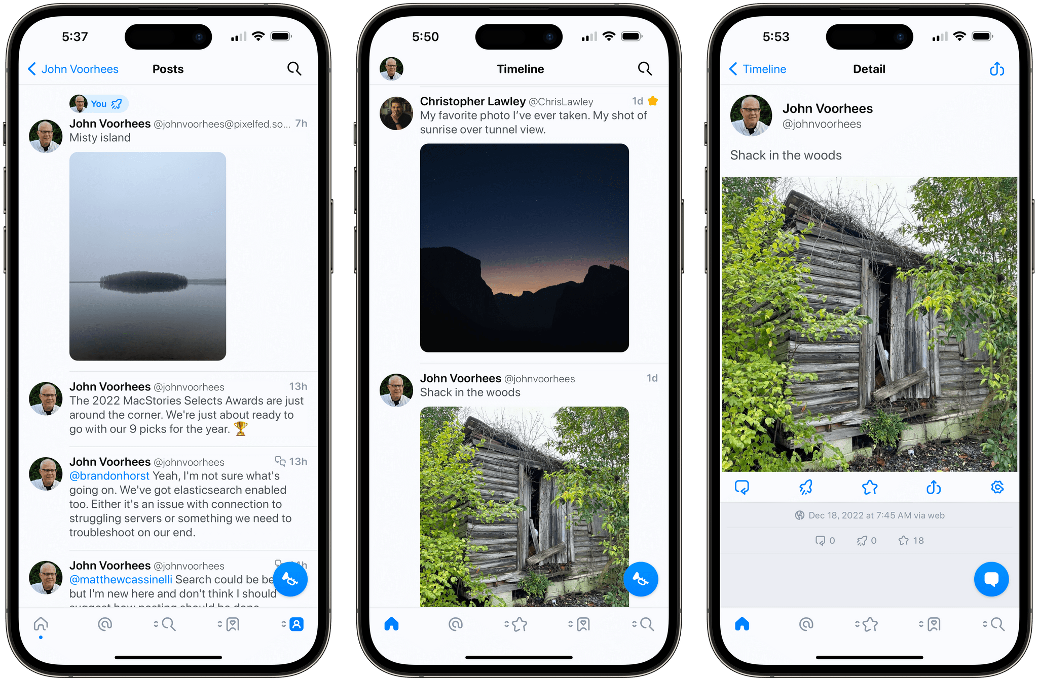
Following Federico using Mastodon's web app (left) and my Pixelfed profile viewed from Tapbots' Ivory Mastodon app (right).

Following Federico using Mastodon’s web app (left) and my Pixelfed profile viewed from Tapbots’ Ivory Mastodon app (right).

Pixelfed is sort of like a decentralized version of Instagram that has adopted the ActivityPub protocol. Users can post photos, follow other users, and send each other messages. The service recently started beta testing an iOS app that is available on TestFlight, so I downloaded it, set up an account, and posted about it on Mastodon.

Because Pixelfed and Mastodon servers both comply with ActivityPub, anyone can follow my Pixelfed account from Mastodon without having to create a Pixelfed account or download the app, which is exactly what Federico did:

In practice, following someone’s Pixelfed feed is even easier. Instead of searching for my username, Federico could have searched for the URL for my Pixelfed profile in a Mastodon app and followed me that way. It’s worth noting, though, that not all Mastodon apps support searching for non-Mastodon servers. If you have trouble adding someone to your Mastodon feed, try Mastodon’s web app, which I’ve tried and know works. Also, be patient because some Pixelfed servers like pixelfed.social are struggling with an influx of new users that have hurt its reliability.

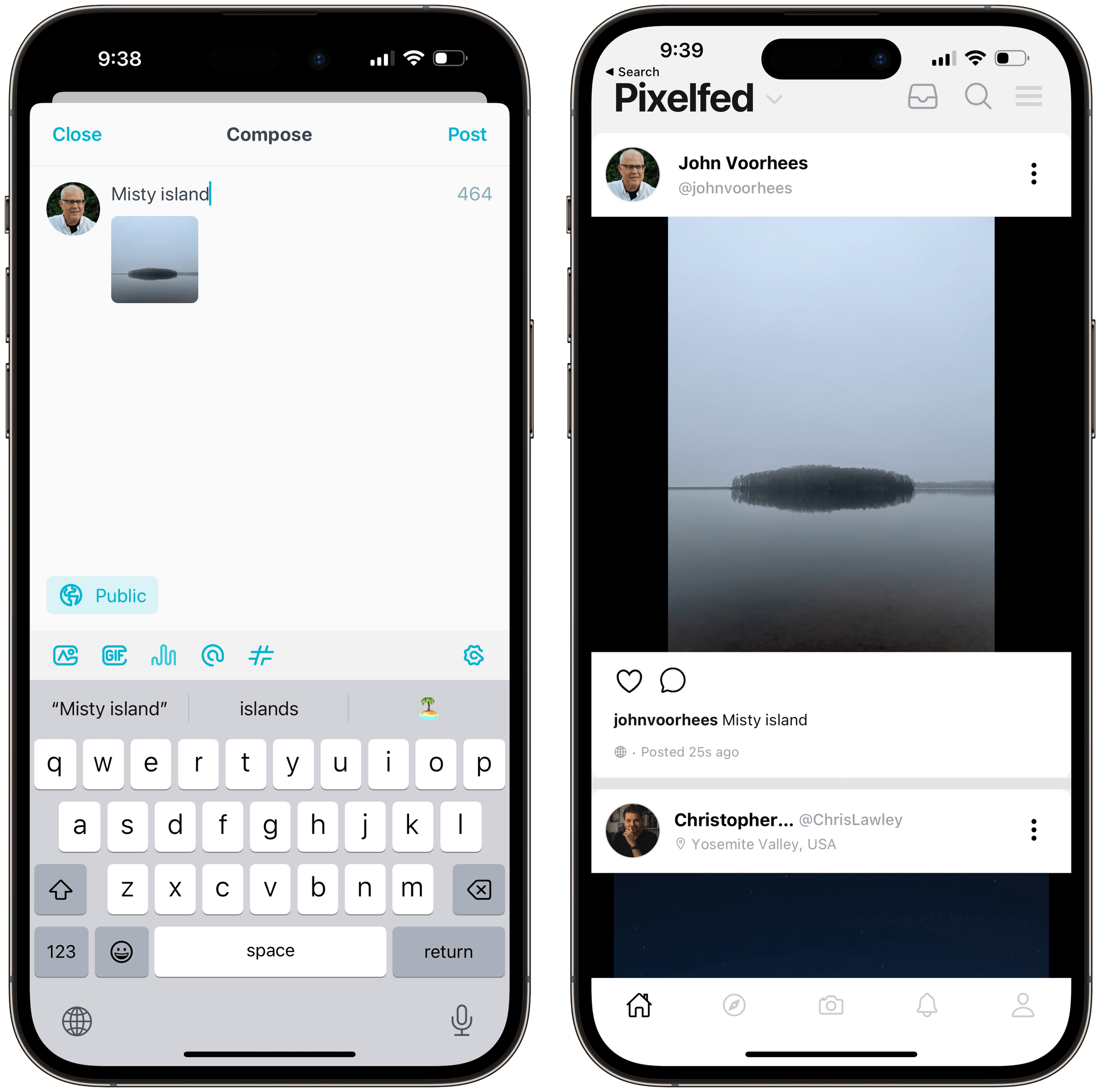
Photos posted from Mastodon (left) appear in the Pixelfed app too (right).

Photos posted from Mastodon (left) appear in the Pixelfed app too (right).

As the owner of a Pixelfed account, ActivityPub provides me some additional benefits too. First, I added my Pixelfed account to Ivory, the Tapbots Mastodon app that’s currently in alpha testing. That lets me post photos and respond to followers in the same app I’m using for Mastodon, which is nice. I’ve also followed my Pixelfed account from my Mastodon account, which allows me to view my posts from my Mastodon feed and boost them to my Mastodon followers, creating the equivalent of cross-posting on two services without actually posting separately to both.

Although there are a growing number of services that support ActivityPub, including PeerTube, a YouTube alternative for video, micro.blog, which supports parts of the protocol, and many others, it’s still early days for the protocol. However, with Twitter reminding users of the peril of relying on a centralized service provider, the pace of ActivityPub adoption is picking up, which should make 2023 a very interesting year for the open web.


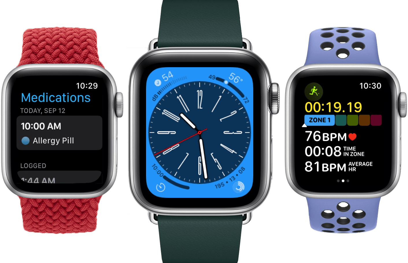
watchOS 9: The MacStories Review

As we enter the ninth iteration of watchOS, I must admit that I sometimes find myself looking back wistfully on the computer watch that the Apple Watch once was. My inner tech nerd misses the wild, blind shots at digital connection and interface design which we were gifted by an Apple that had not yet figured out what the mass market wanted from this device.

In many ways, the early days of the Apple Watch feel like echoes from a bygone era of Apple; an era in which it was more willing to throw things at the wall just to see what stuck. This is, after all, the company which brought us the buttonless iPod shuffle, the hockey puck mouse, brushed metal, the tape-recorder Podcast app, and so much more. We tend to call it Apple’s sense of “whimsy”, and early watchOS had plenty of it.

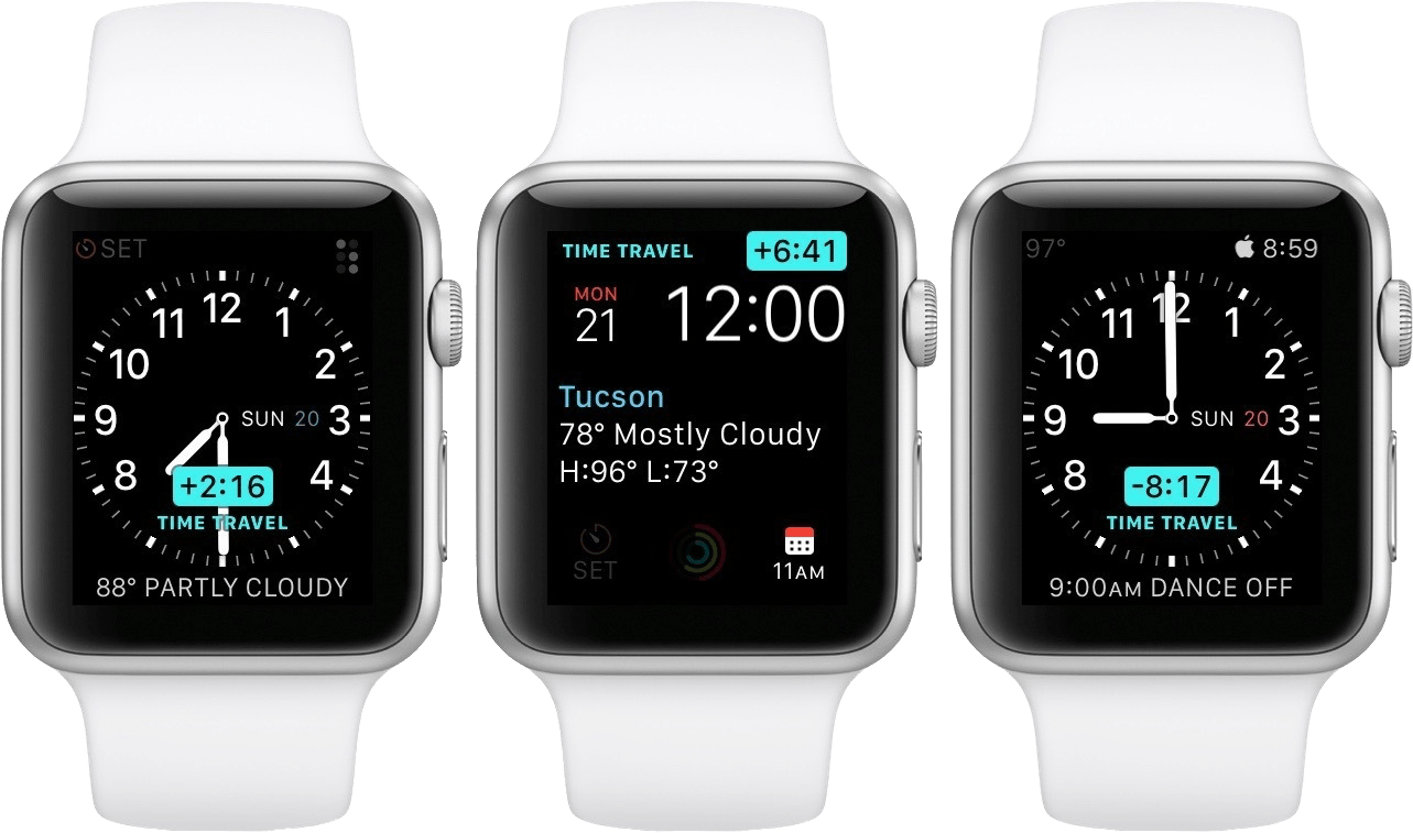
Time Traveling in watchOS 2.

Time Traveling in watchOS 2.

In watchOS 2, Apple shipped a feature called Time Travel where you could spin the Digital Crown to “travel backwards and forwards in time”. Complications would move alongside the watch hands to reflect their past or predicted future values. Time Travel was demoted to a setting in watchOS 3, and quietly removed entirely some time later.

There was also the concept of Glances beginning all the way back in watchOS 1. Glances were single-page app interfaces accessible by swiping up from the watch face, then swiping side-to-side to switch between them. Third-party apps could create these, and the watch supported up to 20 of them. Glances were also canned in watchOS 3. They were replaced by the Dock, which never quite managed to capture the same energy.

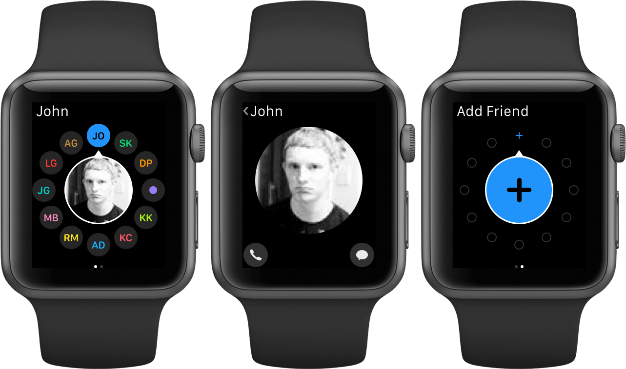
For years, Apple seemed particularly interested in the potential of the Apple Watch to be a core hub for personal communication. Until watchOS 3, the hardware side button on the device was dedicated to opening the Friends interface. When interacting with your friends, you could send giant animated emojis — perhaps a very early precursor to the Memoji that we have today. And of course, no one could forget Digital Touch. Who among us did not feel more connected to our loved ones when tapping out pings and drawing shapes on their wrists1?

The Friends interface in watchOS 2.

The Friends interface in watchOS 2.

What leaves me feeling so conflicted is that, ultimately, all of the above features were pretty bad. No one used the Friends interface, Time Travel wasn’t particularly useful, third-party Glances were kneecapped by their lack of interactivity, and communicating from an Apple Watch has always just been way more work than pulling out your iPhone. Apple was right to kill all of these features in their time, but I still can’t stop missing the days when my Apple Watch was searching for more variety in purpose than it exists with today.

Read more


  1. I imagine Digital Touch is unfazed by my mockery; likely too busy feeling satisfied that it is the only one of the features described above which has (somehow) endured into modern iterations of watchOS. ↩︎

iOS 16: The MacStories Review

Customization is back, and Apple’s having fun again.

When is the last time your iPhone truly surprised you?

The answer to this question is a fascinating Rorschach test that can say a lot about a person’s relationship with Apple’s mobile platform. Some might say it was over a decade ago, when they feasted their eyes upon the Retina display for the first time in 2010. Some might say it happened when the iPhones got bigger – and sales skyrocketed – with the iPhone 6 lineup in 2014. Others might argue that it happened with Face ID on the iPhone X, or the first time they tried Portrait or Night mode, or perhaps when they first took an ultra-wide shot.

My point is: if you ask someone about the last time an iPhone truly surprised them, chances are they’ll reply with a hardware feature. That’s not a shocker: Apple prides itself upon the tight integration they’ve been able to achieve between the iPhone’s hardware and iOS; they’ve successfully managed to turn their design philosophy into a selling point of their entire ecosystem.

People buy iPhones because they know they’re going to work well for a long time, and, usually, because the model they’re getting has a cool new gimmick they want to try. For this reason, it’s not absurd to postulate that, by and large, the iPhone’s software serves to enable hardware sales and subscriptions. I do not mean this pejoratively: I like Apple’s approach, otherwise I wouldn’t be writing annual reviews about their operating systems. But I also recognize that on the iPhone (the situation is the exact opposite on iPad) the software now largely takes the backseat compared to hardware and services.

Which is why whenever the iPhone’s software truly surprises me, I get excited.

Software-related surprises are more rarefied on iOS these days, but the kind of people who are reading this story can point to a few examples in our recent history. Apple buying Workflow, turning it into a system app, and outright claiming that Shortcuts is the future of automation was a surprise. The extent to which Apple integrated dark mode in iOS 13 was a surprise.1 The arrival of two iPad features – Picture in Picture and inter-app drag and drop – on iPhone felt like a surprise. But, of course, no modern feature comes close to the surprise that we all witnessed with iOS 14 two years ago: a renewed focus on user personalization with custom Home Screen widgets and the ability to create multiple Home Screens.2

That’s why, following last year’s welcome (if perhaps a tad uninspired) quality-of-life update that was iOS 15, I’m excited about a new version of iOS again.

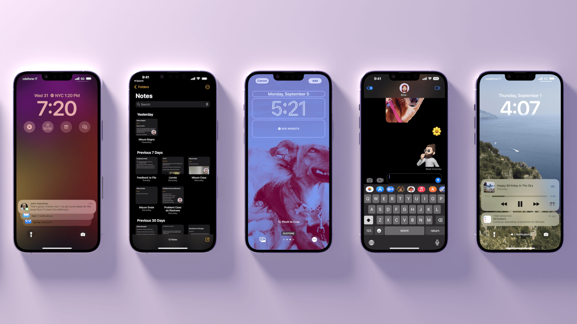
iOS 16, launching today for a variety of iPhone models dating back to the iPhone 8, marks Apple’s triumphant return to user personalization, with a twist: while in 2020 customization might have felt like a happy consequence of Apple’s engineering, this time the company has intentionally marketed iOS 16 as an update that will make an iPhone feel truly your own. As we explored in June and July, the first thing you see on your iPhone – the Lock Screen – is fundamentally changing in iOS 16. With the ability to create multiple Lock Screens, choose from a diverse collection of wallpaper sets, and customize each one with widgets, you’ll now have endless possibilities for the screen you always see when you pick up your iPhone.

Sure, there’s an argument to be made for Lock Screen widgets also being developed in service of new hardware, but I don’t think that takes away from the breadth of this feature and how Apple created a whole narrative around wallpapers, widgets, photos, and Focus modes this year. As you’ll see, the customizable Lock Screen will be the main character of this review: I’ve had a lot of fun exploring different permutations of my Lock Screen this summer, and I’ve been able to test dozens of widgets from third-party developers, which I’ll also showcase in this story.

In keeping with my theory that modern iOS updates always need to have a little bit of something for everyone, there’s a ton of other (some bigger, some smaller) features I’ll be covering in this review.3 Messages, one of my most used apps on iPhone, has received a substantial update with the ability to edit and un-send messages, making it, in some ways, even superior to WhatsApp for me now. Mail – of all apps – has gotten a major upgrade with modern features such as scheduled send and, almost unbelievably, a revamped search that actually works. Reminders has officially turned into a serious task manager with even more filters for smart lists and the ability to create and share templates with others.

The new Lock Screen takes center stage this year and everything else pales in comparison to the massive update it received, but, overall, I find iOS 16 a more fun and useful update than iOS 15.

So, as with every September: let’s dive in.

Read more


  1. Then again, wasn't that in service of OLED displays? ↩︎
  2. Perhaps the iPhone 14 Pro's Dynamic Island will be another major surprise for iPhone users. Fascinatingly, it's going to be a unique blend of hardware and software that shows how Apple has been playing the long game with their design strategy for the past few years, which is now paying off. However, the iPhone 14 Pro is not out yet and I haven't tested the Dynamic Island, so that's beyond the scope of this review. ↩︎
  3. That's in addition to the apps and features we've already covered in our annual OS Summer Series on MacStories↩︎